It’s thrilling how the digital world always evolves, isn’t it? Think about it: your website is often the first interaction someone has with your brand. That’s why getting web design right matters so much.
It’s not only about looking good; it’s about creating experiences that are easy, enjoyable, and memorable. In this guide, I’ll walk you through the latest and greatest in web design best practices to enhance usability and aesthetics.
Whether you’re working on an existing site or starting from scratch. These tips will help you create a website that’s not only beautiful but also effective in drawing in and engaging your audience. Let’s dive in!
1. Simplification in Web Design: Beyond Minimalism

In the web design world, ‘less is more’ is more than just a catchphrase. It’s a principle that guides us towards cleaner, more impactful designs.
But simplicity in web design goes beyond only minimalism. It’s about eliminating clutter, yes, but also about emphasizing the right elements to convey your message effectively.
Why Simplify?
The answer lies in user experience. A simplified design reduces cognitive load, making it easier for visitors to navigate and interact with your site. It’s not about stripping everything away; it’s about finding the perfect balance.
The Essentials of Simplification:
- Prioritize Content: Identify the core message of each page and remove anything that doesn’t support it. Your content should be the star of the show.
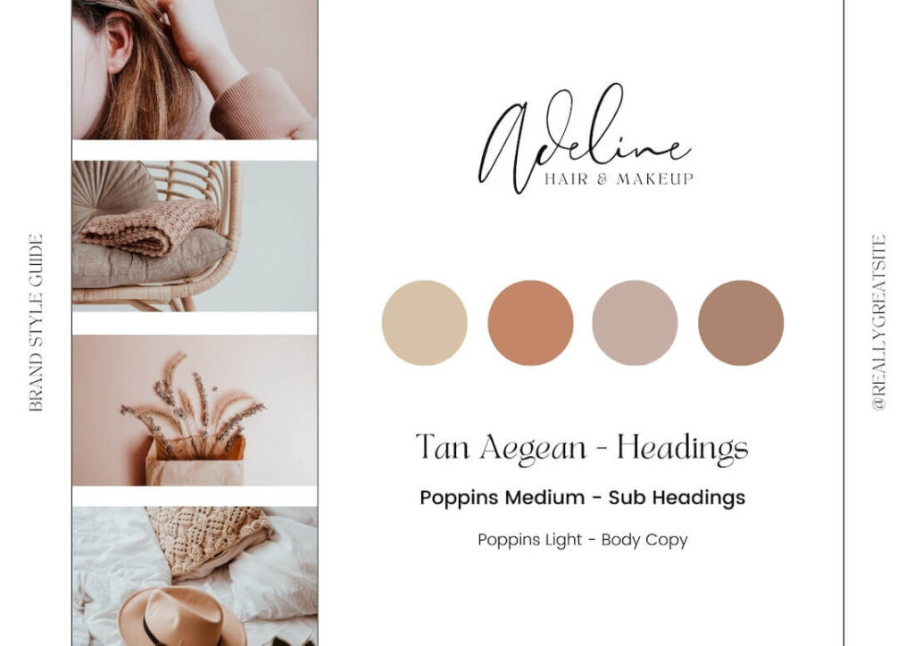
- Limit Color Schemes: Too many colors can be distracting. Stick to a palette that reflects your brand and resonates with your audience.
- Functional Graphics: Every visual element should serve a purpose. Whether it’s guiding user attention or explaining complex information.
- Whitespace is Your Friend: Also known as negative space, whitespace isn’t just empty space. It’s a powerful tool to create focus and harmony in your design.
Real-World Examples:
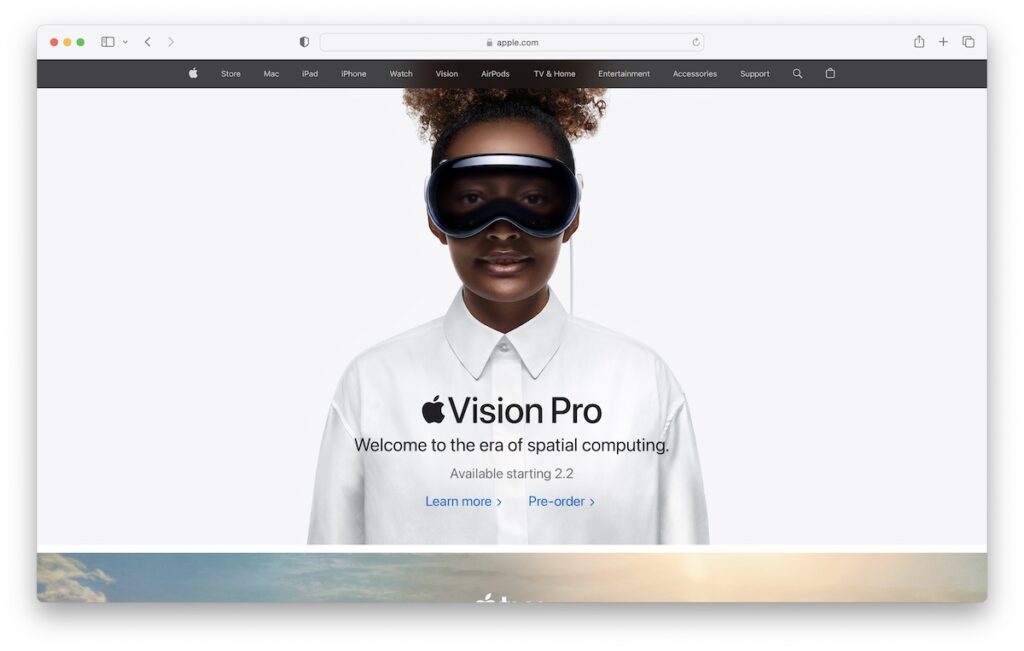
- Take Apple’s website, for example. Its design is a study in simplicity, with ample whitespace, restrained use of color, and imagery that’s all about the product.
- Another example is Google’s homepage. It’s famously sparse, yet it’s one of the most visited pages on the internet. It’s a testament to how effective simplicity can be.
In a world full of information and stimuli, a simplified web design can be like a breath of fresh air for your users. It’s not just about being trendy; it’s about creating a seamless, enjoyable experience for everyone who visits your site.
2. Mastering Visual Hierarchy for Effective Communication

Visual hierarchy in web design is like the map that guides your visitors’ eyes through your site. It’s all about arranging elements in a way that naturally directs attention to what matters most.
Mastering this can make the difference between a website that looks great and one that’s both stunning and strategically effective.
How to Establish a Visual Hierarchy:
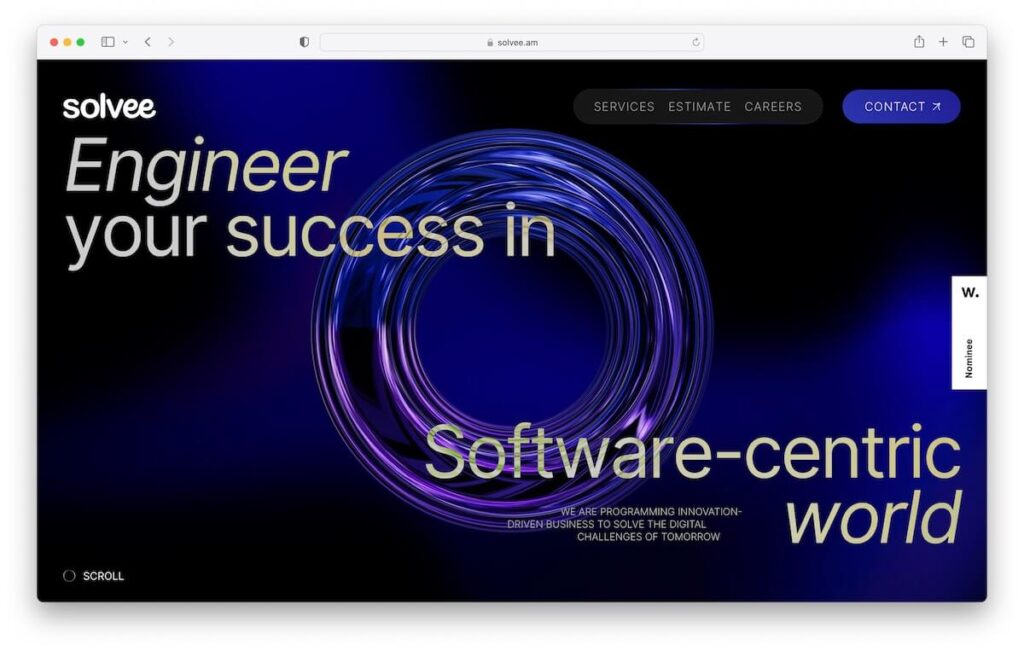
- Size Matters: Larger elements grab attention first. Use size to highlight key areas like headlines or call-to-action buttons.
- Contrast for Impact: Utilize contrasting colors to make essential elements stand out. But remember, a little goes a long way.
- Strategic Placement: Position vital information where eyes naturally go first. Typically the top or center of your page.
- Layering with Typography: Different font sizes and styles can create a sense of order and importance.
Applying Visual Hierarchy in Practice:
- Netflix’s homepage is a classic example. The large, bold titles and vibrant images draw your eyes to the newest or most popular shows.
- The Dropbox website uses contrast and size to draw attention to its call-to-action, making it almost impossible to miss.
Creating a strong visual hierarchy isn’t just about grabbing attention. It’s about creating a clear path for users to follow, from the moment they land on your page to the action you want them to take.
It’s a subtle yet powerful way to enhance user experience and communicate more effectively.
3. Crafting Intuitive and User-friendly Navigation

The navigation of your website is its backbone. It’s not only about getting from point A to B.
It’s about how effortlessly and intuitively your users can move around.
A well-designed navigation system doesn’t only help users find what they’re looking for. It enhances their all-around experience.
Key Elements of User-Friendly Navigation:
- Simplicity is Key: A cluttered menu can overwhelm users. Keep your navigation simple, clean, and easy to understand.
- Consistency Across Pages: Ensure that your navigation system is consistent across all pages. This predictability makes users feel more in control.
- Strategic Use of Breadcrumbs: For sites with many layers, breadcrumbs are a navigational support that helps users keep track of their locations without having to rely on the back button.
- Search Functionality: Especially for content-rich websites, including a search bar is a user-friendly addition that allows visitors to find what they need fast.
Navigation Done Right Examples:
- Amazon’s website is a great example. Despite the vast array of products, its navigation system is quite intuitive, with clear categories and a powerful search tool.
- Another example is the BBC website, where the navigation is straightforward. Guiding users through a massive amount of content.
Intuitive navigation is more than a convenience; it’s a fundamental aspect of good web design. It respects the user’s time and effort, making their journey through your site as smooth as possible.
4. Branding and Visual Consistency: Building Trust and Recognition

A strong brand identity is like a signature – it makes your website instantly recognizable. In a world, where millions of websites compete for attention. A consistent brand identity can be your ace in the hole.
It’s not only about aesthetics; it’s about creating a cohesive experience that resonates with your audience.
Building a Consistent Brand Identity:
- Uniform Color Palette and Typography: Choose a color scheme and typefaces that reflect your brand’s personality and use them consistently across your website.
- Consistent Imagery and Graphics: Use visuals that align with your brand’s tone and message. Consistency in visual elements reinforces brand recognition.
- Voice and Tone in Content: The way you communicate with your audience should mirror your brand’s character. Whether it’s professional, playful, or somewhere in between, keep it consistent.
Examples of Consistent Branding:
- Apple’s website is a testament to brand consistency. From its color palette to the imagery, everything aligns perfectly with its sleek, minimalist brand identity.
- Airbnb uses consistent fonts, colors, and imagery to create a welcoming and community-oriented feel across its platform.
Your brand is your story, and your website is where this story unfolds. Consistent branding isn’t about looking flawless. It’s about creating a sense of familiarity and trust with your audience.
5. Readability and User Engagement: Best Content Practices

Where content is king but it’s not about what you say. It’s more about how you present it. Readability and engagement go hand in hand in creating a successful web presence.
Your content needs to be not only informative but also easy to digest and engaging to keep your audience interested.
Enhancing Readability and Engagement:
- Clear and Concise Copy: Use simple language that’s easy to understand. Avoid jargon and overly complex sentences that might confuse your readers.
- Structured Layout: Break your content into smaller paragraphs with clear headings. This makes it easier for readers to scan and find the information they’re looking for.
- Use of Bullets and Lists: When appropriate, use bullet points or lists. They’re great for breaking down information into manageable, readable chunks.
- Visual Aids: Incorporate images, infographics, or videos to complement your text. Visuals can help illustrate complex ideas and add a dynamic element to your content.
Real-World Application:
- The Guardian’s website is a prime example of readability done right. With a clean layout, crisp fonts, and well-structured articles, it’s a go-to for easy-to-read news.
- BuzzFeed excels in engagement, using a mix of compelling headlines, lists, and a variety of media to keep readers scrolling and interacting.
In 2024, making your content readable and engaging isn’t just a nice-to-have; it’s essential. It’s about respecting your audience’s time and attention. Providing your audience with value in a format that’s both enjoyable and accessible.
6. Embracing Responsive and Inclusive Design

In our increasingly connected world, your website is accessed from a multitude of devices and by a diverse audience. Responsive and inclusive design isn’t just a trend; it’s a necessity. It ensures that everyone, regardless of their device or abilities, has a seamless and positive experience on your site.
Principles of Responsive and Inclusive Design:
- Flexible Layouts: Design your site with a fluid grid that adapts to different screen sizes. This ensures your content looks good on any device, from a smartphone to a desktop.
- Accessible to All: Consider all potential users, including those with disabilities. Use alt text for images, ensure keyboard navigability, and provide transcripts for videos.
- Testing Across Devices: Regularly test your website on various devices and browsers to ensure consistency in performance and appearance.
- Consider Load Times: Optimize images and scripts to ensure your site loads fast on devices with slower internet connections.
Showcasing Responsive Design:
- Spotify’s website is a brilliant example of responsive design. Whether on a mobile, tablet, or desktop, the user experience remains consistent and engaging.
- The BBC News website stands out for its inclusive design, with options for increased text size and high contrast, making the content accessible to a wider audience.
In the era of digital inclusivity, responsive and inclusive design is key to reaching a broader audience and providing a universal experience. It’s not just about adapting to screen sizes; it’s about creating an accessible space for all.
7. The Strategic Visual Storytelling and Interactive Elements

A picture is worth a thousand words, and in web design, visual storytelling can engage your audience in a way that text alone cannot. By combining compelling visuals with interactive elements. You can create a memorable experience that captivates and informs your visitors.
Harnessing the Power of Visuals and Interactivity:
- Purposeful Imagery: Use high-quality images that tell a story about your brand or product. They should evoke emotions and connect with the viewer on a personal level.
- Interactive Features: Interactive elements like hover effects, animations, and clickable elements can enhance user engagement and make your site more dynamic.
- Infographics and Animations: Present complex information in an easily digestible format using infographics and animations. They’re not only informative but also entertaining.
- Consistency in Visual Elements: Ensure that your visuals and interactive features are consistent with your brand identity and enhance, rather than distract from, the user experience.
Examples of Visual Storytelling in Action:
- The New York Times uses interactive graphs and immersive photo essays to bring stories to life, making complex topics more approachable.
- Airbnb’s use of beautiful imagery and interactive maps helps users visualize and plan their travel experiences more effectively.
Visual storytelling and interactive elements are about more than just aesthetics. They’re tools to communicate more effectively with your audience. When done right, they can turn a simple visit to your site into an engaging journey.
8. The Psychology of Effective CTAs

Calls to Action (CTAs) are crucial in guiding your visitors toward your desired goal. Whether it’s signing up for a newsletter, making a purchase, or downloading a resource. But what makes a CTA effective isn’t only its placement or color. It’s understanding the psychology behind what prompts users to take action.
Crafting CTAs That Convert:
- Action-Oriented Language: Use verbs that inspire action, such as “Get,” “Start,” “Join,” or “Discover.” This language energizes your CTAs and makes them more compelling.
- Color and Contrast: Choose colors that stand out but also align with your overall design. The right contrast can draw attention without being jarring.
- Sense of Urgency: Phrases like “Limited Offer” or “Sale Ends Soon” can create a sense of urgency, encouraging users to act promptly.
- Placement and Size: Position your CTAs where they’re most likely to get noticed without disrupting the user experience. Size should always be proportional – noticeable but not overwhelming.
Effective CTA Examples:
- Netflix excels with its simple yet powerful CTAs. “Join Free for a Month” is clear, compelling, and offers a no-risk way to engage with the service.
- Dropbox uses “Sign up for free,” which is direct and highlights the no-cost aspect. Making it an attractive proposition for new users.
The psychology behind CTAs is about understanding human motivation and designing elements that tap into these motivations. When you get it right, CTAs can significantly increase conversions and engagement on your site.
9. Enhancing Website Performance: Speed and SEO

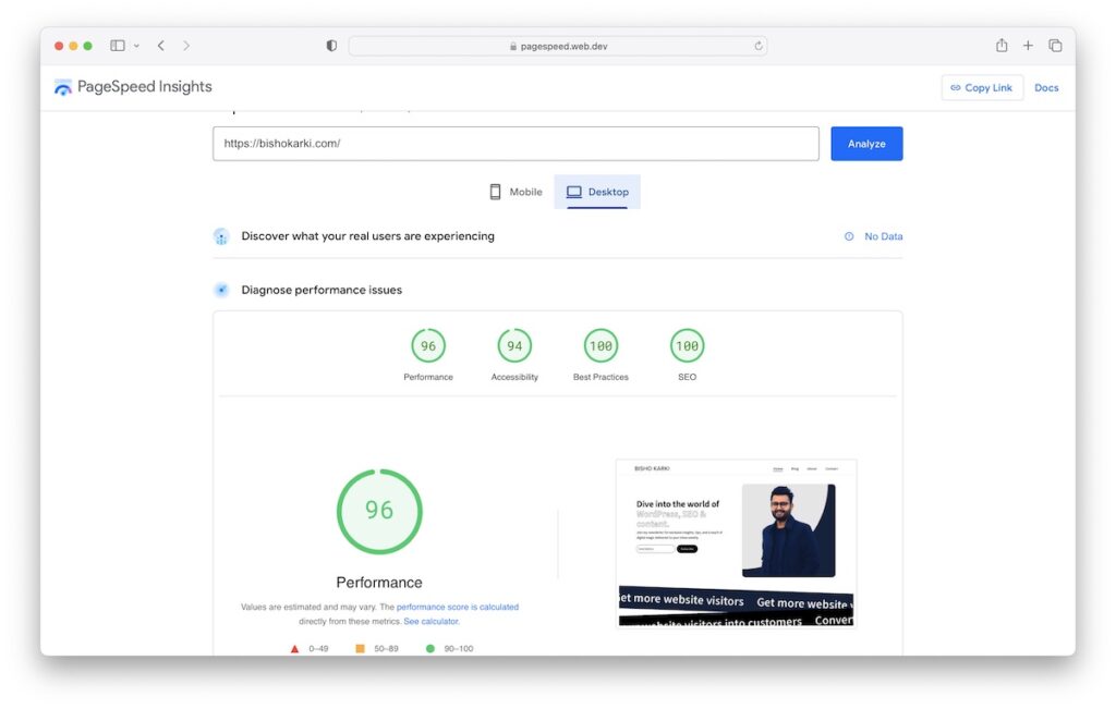
Web speed isn’t only a convenience in 2024; it’s a necessity. A fast-loading website not only provides a better user experience but also ranks higher in search engine results. SEO isn’t only about keywords. It’s more about the performance and usability of your website.
Optimizing for Speed and SEO:
- Image Optimization: Large images can slow down your site. Use formats like JPEG or WebP, and consider tools for image compression without losing quality.
- Minimize HTTP Requests: Reduce the number of elements that need to load. This includes combining CSS and JavaScript files and minimizing their use.
- Leverage Browser Caching: Caching stores parts of your site on the user’s browser for faster loading on return visits.
- Responsive Design: Responsive websites perform way better in search rankings. Ensure your site is optimized for all devices.
Real-Life Examples of Optimized Websites:
- Amazon is a prime example of performance optimization. Despite its vast inventory and complex features, the site loads quickly and ranks high in search results.
- Google’s own website is a masterclass in optimization. With its minimalistic design and efficient use of resources, it sets the standard for speed and performance.
Optimizing your website’s speed and SEO is not just about improving rankings. It’s about providing a better, more efficient experience for your users.
Wrapping up, great web design is more than just good looks. It’s about creating an intuitive, engaging, and effective online presence. From streamlined navigation and compelling visuals to responsive design and fast load times. Every element works together to enhance the user experience.
Remember, your website is a dynamic part of your brand’s story, evolving with trends and user needs. Embrace these best practices to craft a website that’s not only visually striking but also user-centric and high-performing.
Here’s to building web experiences that captivate and connect!


