
Welcome to our exploration of web typography. This blog will guide you through the essential principles of typography in web design.
It’s crafted for new web designers, developers, and anyone interested in how typography shapes user experience and communication on the web. Join me as we delve into the subtle yet powerful world of web typography.
Let’s start on this journey to understand and master the art of web typography.
1. Understanding Typography in Web Design
What is Typography?
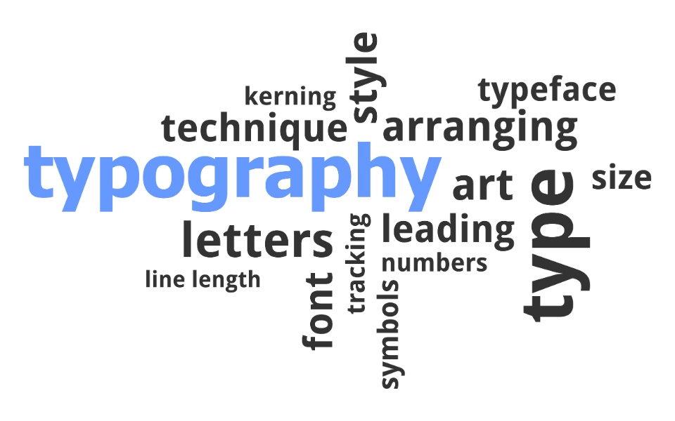
At its core, typography is the art of arranging letters and text in a way that makes the content legible, clear, and visually appealing. It’s not just about choosing a font – it involves the consideration of line length, line spacing, and letter spacing to enhance the reading experience.
In web design, typography plays a pivotal role as it greatly affects usability and user experience.
Why Does it Matter?
- First Impressions: Typography is often the first thing a user notices on a website.
- Readability: Good typography ensures that content is easy on the eyes and enjoyable to read.
- Brand Identity: Typography can reflect a brand’s personality and values.
- User Engagement: Engaging typography keeps visitors on your site longer.
Diving into Font Families
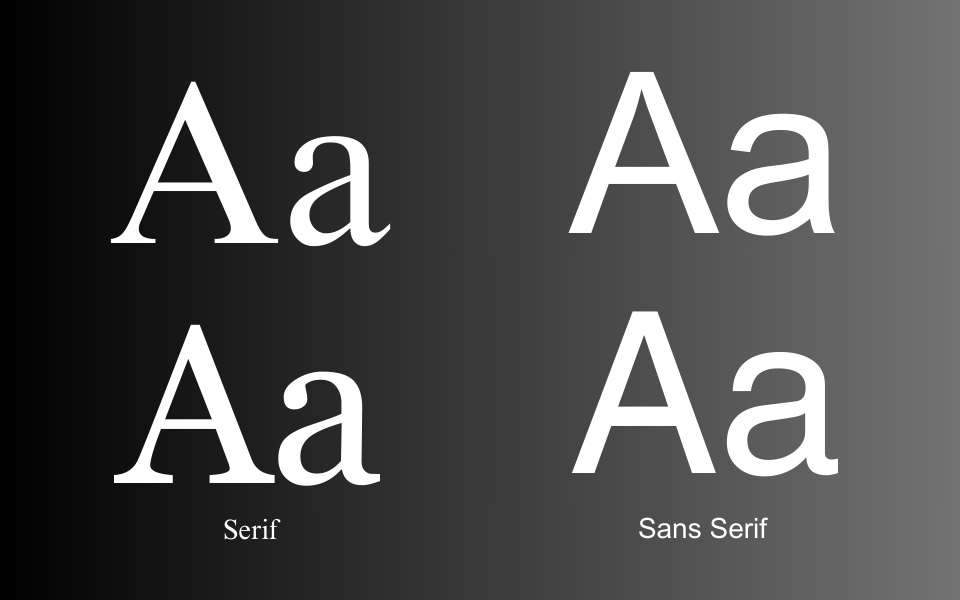
There are two major types of font families that dominate web design:
- Serif Fonts: Think of these as fonts with ‘feet’. Examples include Times New Roman and Georgia. They’re traditional, easier on the eyes for long reads, and often used in more formal or classical contexts.
- Sans-serif Fonts: Sans-serif means ‘without serifs’. Fonts like Arial and Helvetica fall into this category. They are clean, modern, and highly legible, making them a go-to choice for web and screen use.
Each font type conveys a different mood and tone, playing a significant role in the overall design and feel of a website.
Real-world Examples of Effective Typography
To understand how these principles are applied in practice, let’s look at some examples.
- If you look at Medium’s website – Notice how they use sans-serif fonts for a clean, minimalistic reading experience.
- Another example at The New York Times is a mix of serif for articles, reflecting their formal and established brand, and sans-serif for navigation and features.
2. Core Principles of Web Typography
The Magic Trio: Kerning, Tracking, and Leading
Typography is an art, and like any art, it’s all about the details. Let’s dive deeper into these crucial elements:
- Kerning: It’s not just space between letters; it’s about creating harmony in words. Imagine kerning as the fine-tuning that prevents letters from awkwardly bumping into each other or drifting apart.
- Tracking: This is the spacing uniformity across words and sentences. Proper tracking ensures your text doesn’t feel cramped or overly stretched, aiding in a smooth reading flow.
- Leading: Often overlooked, leading is the vertical spacing between lines. It’s the breathing room for your words, ensuring each line stands out for easy reading without merging into the next.
Choosing Fonts: More Than Just Looks
- Selecting the Right Font: It’s a balance between personality and clarity. The font you choose should echo your brand’s voice without sacrificing readability.
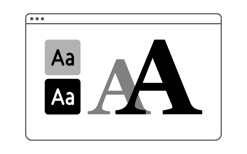
- Size Matters: Ideal font size optimizes readability and comfort. Too large, and it’s overbearing; too small, and it’s a strain.
Each of these elements plays a crucial role in how your content is perceived and consumed. In the next section, we’ll dive deeper into the art of choosing the perfect font.
3. Choosing the Right Font
Selecting the perfect font is more than just a design choice; it’s about creating the right tone for your audience. Here’s a more detailed approach you can try:
- Serif vs. Sans Serif: Serif fonts, like Times New Roman, bring a classic, formal look. Sans serif fonts, like Arial, are modern and clean.
- Brand Alignment: Your font should mirror your brand’s personality. Is your brand modern or traditional? Choose a font that reflects this.
- Context and Audience: Understand who your readers are. A tech blog might benefit from a sleek, modern sans serif, while a literary magazine might prefer the elegance of a serif.
- Readability: Always prioritize how easy it is to read your content. Clear, legible fonts are key.
- Functionality and Form: Balance aesthetic appeal with practicality. A beautiful font that’s hard to read will turn visitors away.
- Experiment, But Wisely: Don’t be afraid to try unconventional fonts, but always keep legibility in mind.
Examples of Popular Web Fonts
- Serif Fonts: Times New Roman, Georgia, Garamond.
- Sans Serif Fonts: Arial, Helvetica, Roboto.
Beyond the Basics
- Mixing Fonts: Combine fonts wisely. A good rule of thumb is to pair a serif with a sans serif for contrast.
- Mood Setting: Fonts set the mood. A playful font for a children’s site, a professional font for a law firm.
Fonts That Speak Volumes
- For Professional Sites: Consider fonts like Lato or Merriweather.
- For Creative Sites: Play around with fonts like Poppins or Baskerville.
In our next section, we’ll explore how typography influences user experience and engagement.
4. Typography and User Experience
The Impact of Typography on UX
Good typography isn’t about aesthetics only; it’s a crucial tool in shaping user experience (UX) on your website. Here’s why:
- Guiding the Reader: Well-planned typography leads the eye smoothly across the page, making navigation intuitive.
- Creating Comfort: A readable font with appropriate spacing makes browsing your site a comfortable experience, encouraging visitors to stay longer.
- Setting the Tone: The style of your font can set the mood – professional, whimsical, serious, or relaxed.
Enhancing Engagement through Typography
- Emphasizing Content: Use font weight and size to highlight key information, making it stand out.
- Balancing Elements: Harmonize text with other elements like images and white space to create a cohesive look.
- Consistency is Key: Keep your typography consistent across all pages for a unified brand experience.
In our next section, we’ll explore responsive typography and how it adapts to various devices, ensuring your website’s typography looks great no matter where it’s viewed.
5. Responsive and Accessible Typography
The Need for Flexible Typography
In the era of smartphones, tablets, and desktops, responsive typography ensures your content looks stunning on any device. Here’s how to achieve it:
- Adaptive Font Sizes: Implement flexible font sizes that adjust to the screen size, ensuring readability whether on a tiny phone or a large monitor.
- Media Queries in CSS: Use CSS media queries to change typography styles based on device characteristics.
- Legibility on Different Devices: Consider the varying distance from which users view different devices and adjust letter spacing and line height accordingly.

Responsive Design Best Practices
- Test Across Devices: Regularly test your typography on various devices to ensure consistent user experiences.
- Scalable Vector Fonts: Utilize scalable vector fonts to keep text sharp and clear at any resolution.
- Load Times Matter: Be mindful of font load times, especially for mobile users.
Next, we’ll explore the role of typography in setting current trends in web design. I’ll show you how typography is not just about readability, but also about making a statement.
6. Current Trends and Future of Web Typography
Typography as a Design Statement
Modern web design increasingly views typography as a critical element of artistic expression. Here’s what’s trending:
- Bold and Expressive Fonts: Big, bold fonts make a statement and grab attention.
- Minimalist and Clean: On the flip side, there’s a trend towards minimalist, ultra-readable fonts.
- Creative Font Pairings: Designers are getting adventurous, pairing contrasting fonts for a dynamic look.
Embracing the New, Respecting the Old
- Vintage and Retro Fonts: A resurgence of old-style fonts brings nostalgia to web design.
- Variable Fonts: These offer immense flexibility with various styles encapsulated in a single font file.
- Color Fonts and Gradients: Using colored and gradient fonts for a visually striking effect.
In the next section, we’ll discuss common typography mistakes and how to avoid them, ensuring your website’s typography is not just trendy but also effective and user-friendly.
7. Common Mistakes and Best Practices
Navigating Typographic Pitfalls
Even the best designs can be marred by typographic missteps. Here’s how you can sidestep common errors:
- Overcrowding Text: Too much text packed together is overwhelming. Ensure adequate spacing for readability.
- Inconsistent Typography: Consistency in fonts, sizes, and styles across your site reinforces your brand and improves user experience.
- Ignoring Hierarchy: Failing to establish a clear hierarchy can leave users confused about where to focus.
Best Practices for Flawless Typography
- Contrast and Legibility: Ensure there’s sufficient contrast between your text and its background.
- Size Matters: Font size shouldn’t be too small for mobile users or too large for desktop users.
- Limit Font Varieties: Using too many different fonts can create a disjointed look. Stick to two or three complementary fonts.
Up next, we’ll dive into the intersection of typography and SEO, revealing how your typographic choices can influence your website’s visibility in search results.
8. Typography in SEO and Web Performance
You may think there’s not any direct correlation between Typography and SEO. But it influences not only user experience but also SEO in subtle ways:
- Readability and Engagement: Search engines favor content that provides a good user experience, which includes readability. Well-executed typography can reduce bounce rates and increase time on site.
- Mobile Optimization: With the increasing emphasis on mobile-first indexing by search engines, responsive typography becomes crucial for SEO.
Search Engine Friendly Typography Tips
- Alt Text for Text in Images: If your website uses images with text, always include alt text for SEO purposes.
- Avoid Overloading with Custom Fonts: While custom fonts are great for branding, they can slow down your site. Optimize font loading to maintain site speed.
- Web-Accessible Fonts: Choose fonts that are accessible and render well across all browsers and devices for better SEO performance.
Now that you’re armed with these insights, it’s time to revisit your web design. Experiment with typography, keep the user experience at the forefront, and watch how these subtle changes can significantly enhance the overall impact of your website.
Remember, in the world of web design, typography is not just about what you say, but how you present it.
I hope this guide inspires you to explore the vast possibilities of web typography. Happy designing!